Design in a Pinch: Simple Extrapolation
My fab sister-in-law is getting married in June, and as is oft the case in my familial circles, I as web guy was a natural candidate to make the wedding website.
“Would love to,” I said to Jen upon her request, “just give me whatever text, images, and design elements from your invitations and I’ll put it together.”
She did a bang-up job in giving me the site pages + content–it was one of the easiest copy-and-paste jobs I’ve ever done.
In the visuals department I got a shot of the wedding venue, a vector art graphic of a monochrome tree which adorns the invites (in a lovely shade of blue, #315683), and photo of the happy couple in Italy, taken in the proud tradition of heads tilted together smiling at an outstretched arm.
 In total, this is not a whole lot of guidance, design-wise: a single motif in a single color. I generally love (and prefer) collaboration with a designer who supplies me with pretty pixels that I get to bring to life in web form. But in this instance, no such luxury. I’m not a designer myself, but I can pass for one in a pinch–this makes another occasion in which my experience with and lessons from the exceptional design talent at Playground comes in handy.
Turns out a single color and a single image can go along way to create a comprehensive aesthetic.
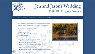
By picking a suitable matting color (in this case white to serve as the background for blue text) and picking a darker shade of the same hue for low-lights (in this case #0D2B4C, picked fairly willy-nilly from the ColorZilla color picker), you’ve got a nice base for a unified look of text, image borders, backgrounds, drop shadows, and gradients. The monochrome motif can be employed in a few places tastefully as ornamentation (in this case, part of the header image and a large content background, muted by a partially opaque white mask).
 The result? Not too shabby, methinks. From a single graphic and one color, the whole design comes out as an extrapolation: resizing the graphic twice, deriving two other colors and some CSS3 goodness were all design prowess it took to take the WordPress 2011 theme to the end result, www.jen-and-jason.com.